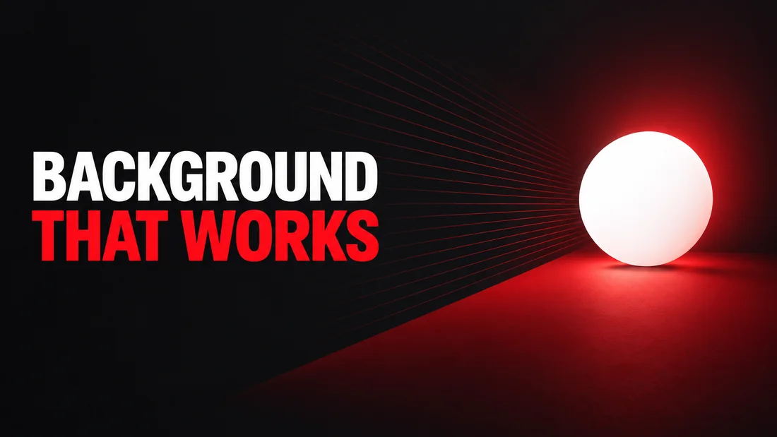
An AI thumbnail background should explain the setting without becoming the story. Generated images often fail here because a broad request such as FUTURISTIC STUDIO invites screens, lights, props, labels, and reflections everywhere. The result may look rich at full size but lose its subject when reduced. A useful background has a specific job: establish context, create separation, guide the eye, or hold readable words. It rarely needs to do all four with equal strength. This guide shows you how to decide what belongs behind the focal point, describe depth and detail in a prompt, reserve intentional empty space, and correct a background that is close but too busy.
Give the background one job
Decide why the background exists before describing what it contains. If the video is a camera review, the background might provide a dark studio context and separate the camera body. If the video is about a home renovation, it might show the room before the result while leaving a clear area for the finished feature. If the video is a tutorial, it might simply create a clean field for a screen and three short words.
A setting becomes useful when it supports the focal point. Ask for a kitchen only if the kitchen clarifies the video. Ask for a chart only if the chart contributes to the promise. Decorative monitors, arrows, shelves, particles, and floating icons often feel relevant because they match the topic, but they can compete with the subject at small size.
As of September 2026, YouTube's Thumbnail and title tips page says that overly complex designs can overwhelm viewers. The same page recommends easy-to-read fonts. Both recommendations become easier to follow when the background has one clear job and a lower visual priority than the subject and words.
Write the job as a short instruction before adding style. CREATE A DARK TECH SETTING THAT SEPARATES THE WHITE LAPTOP is more useful than BEAUTIFUL CYBERPUNK OFFICE. The first request defines a relationship. The second invites a genre scene with no limit on detail.
Build depth in layers
Good depth makes a flat thumbnail easier to read. Think of three zones: a foreground accent, the main subject plane, and a distant background. The background should become softer and less detailed as it moves away. This gives the subject a crisp place in the visual hierarchy without requiring a thick outline around everything.
A travel guide leans on this more than any niche, because the place is the subject and the background at once; thumbnails for travel guides start from your own photo of it. An outdoors channel fills the same three zones with the catch: the fish held toward the lens in front, you behind it, the water soft beyond, as the hunting and fishing thumbnails show.
Use overlap carefully. A large background shape can sit partly behind a product to anchor it, while distant lights remain separate from its silhouette. Avoid placing a bright vertical line behind a person's face or a detailed object directly behind thumbnail words. AI models often create accidental tangencies where edges touch. Those collisions make separate objects appear fused.
Scale can imply depth with very little content. One large soft circle behind a small sharp product may be enough. A broad dark wall, one red doorway, and a faint floor line can suggest a room without filling it with furniture. Blur should be directional and intentional. Ask for a softly defocused distant setting, not a generally blurry image that also weakens the subject.
Depth is especially useful when you build from a reference. Study the reference as an idea: perhaps the subject is crisp, the background is broad, and one light shape points inward. Carry those relationships into a new design instead of trying to preserve its arrangement. The composition over face guide explains why the structural idea can matter more than copying a familiar person.
Reserve useful empty space
Empty space is an active part of a thumbnail. It gives words a readable home, separates the subject, and makes the main shape feel deliberate. It does not have to be pure black or a flat blank rectangle. A quiet gradient, broad shadow, or softly lit wall can provide context while remaining calm enough for text.
Name where the space should be and what must stay out of it. For example: KEEP THE LEFT THIRD DARK AND FREE OF OBJECTS FOR THE WORDS. This is clearer than LEAVE ROOM FOR TEXT because it defines location, value, and content. If the subject faces inward, place the open area in front of the gaze. If the product leans one way, use the opposite side to balance it.
A brief to paste
Words. I WAS WRONG
Instructions. Place the bright camera on the right. Create a soft dark-red studio background with broad shapes only. Keep the left third dark, uncluttered, and free of highlights for the words.
Keep words short enough to benefit from the space you reserve. A full sentence forces small type or a larger empty zone than the image can support. The YouTube thumbnail text guide helps you decide what the image should say and what belongs in the video title instead.
Control detail and texture
AI generation responds well to concrete limits. LOW DETAIL, BROAD SHAPES, and NO SMALL OBJECTS BEHIND THE SUBJECT describe visible conditions. CLEAN and PROFESSIONAL are judgments, so the model can satisfy them with glossy lights, tiny props, or extra effects. Pair the desired mood with the detail limit.
Put texture at the edges rather than beneath critical information. A little grain, smoke, paper fiber, or speed-line energy can keep a simple design from feeling empty. Let it fade before it reaches a face, product silhouette, or word group. If every zone has a different texture, the background starts behaving like several separate subjects.
Repetition is another common failure. A request for a creator studio may produce rows of screens, identical lights, and repeated icons. Limit the count when an item matters: one large screen shape, two soft lights, no readable interface text. If an object does not matter, describe its mass instead of naming it. DISTANT DARK EQUIPMENT SHAPES gives context without requesting five new focal points.
Watch for invented writing. Posters, packaging, storefronts, and screens may introduce unwanted letters. Keep those surfaces blank unless their wording is essential. When words do matter, enter them in the dedicated words field rather than hiding them inside the background description. A focused request makes it easier to judge whether the result followed the brief.
Match color to separation
The background color should make the subject easier to recognize. Begin with the subject's dominant light value and hue. A dark blue jacket may need a warm, lighter field or a narrow edge light. A pale product may need a deeper background. A red object can work against red only when brightness, temperature, or texture creates a clear boundary.
Avoid asking every color to be vivid. One strong accent is easier to organize than four saturated areas. Let the background carry the mood at a lower intensity, then place the strongest accent near the key feature or word. If you need a broader palette plan, use the thumbnail color guide, then return to the edge between the subject and background.
Test the generated image in grayscale. If the subject disappears, the design relies on hue without enough light difference. Test it small as well. Fine color shifts that look elegant on a monitor can become one patch on a phone. Change the large background value before adding strokes or glow around every element. The checks the whole thumbnail has to pass, background included, are in the twelve YouTube thumbnail best practices.
Consider the thumbnail's outer edge too. A black background can dissolve into a dark YouTube interface, while a white edge can disappear on a light one. You do not need a border by default. A contained color field, visible corner shape, or soft internal vignette can define the frame on both. As of September 2026, YouTube's Thumbnail & title tips page notes that thumbnails appear differently across devices, so inspect the full image in more than one context.
How to do this in WThumb
Start with a reference that demonstrates the kind of background relationship you want. A YouTube link fetches only that video's public thumbnail, or you can upload a PNG, JPEG, or WebP. The reference is a brief, not a template. The setting idea can carry over while the design remains new.
- Add the reference and decide whether the background should establish place, separate the subject, guide the eye, or hold words.
- Add an optional personal photo. Without one, the result is faceless, the person in the reference is removed, and the space is filled in the same style.
- Enter up to three lines of words. In the instruction line, state the background's location, level of detail, color value, and any area that must remain clear.
- Add up to four extra images as @1 to @4 when a product, texture, or color sample matters. They act as briefs, not templates.
- Choose 16:9, 9:16, or both, and request one or two designs. Generation takes about thirty seconds and returns a Full HD+ JPEG.
Make one precise correction
If the result is close, press the pencil on it and ask for one background correction. Try REMOVE THE SMALL SCREENS AND KEEP ONE DARK RED WALL BEHIND THE SUBJECT. It creates one new version and costs one credit (1 credit = 1 thumbnail), and you can revise that version again. There is no layered workspace.
Words pass through a moderation service before generation, and a refused request costs nothing. The starting offer is simple: new accounts get two free credits. No card is needed, and paid plans are there when you need more.