Put two to four short words on a YouTube thumbnail, and make them say something the picture cannot. The title is where the complete, searchable sentence lives; the words on the image are the hook, and they should not repeat the title. That is our working rule at WThumb, not a finding from a study, and the rest of this post is the reasoning and the exceptions.
Five questions, in order. Should there be words at all? How many? What should they say when the title sits right next to them? Capitals or not? And how do you know whether they can be read at the size YouTube shows them? The other checks a thumbnail has to pass are in the YouTube thumbnail best practices checklist.
In WThumb the words box takes up to three lines, so the cut from title to thumbnail words happens before anything is generated. Below we cut one twelve-word title down to three, and name the mistake to avoid in that box.
How many words should be on a YouTube thumbnail?
Two to four, and short ones. It is the count that survives the two tests a thumbnail has to pass, being read at a glance, and at the size of a stamp on a phone. One word passes both easily. Four short words pass if the typeface is heavy. Six usually fail the second, and a sentence fails both.
The number is a budget, not a target. If the picture says everything, spend none of it. If the video needs one word to make sense, spend one. Reaching for the upper end every time usually means the thumbnail is being asked to do the title's job.
Length matters as much as count. WRONG is five letters. MISUNDERSTOOD is thirteen, and at feed size it is a gray smear. When a long word is unavoidable, let it be the only word. A second language does not double the budget: the language lesson thumbnails post puts the hook in the viewer's language and the lesson word in the one they are learning, inside the same three lines.
Enough words to make the picture mean one thing, and not one more.
Should a YouTube thumbnail have text at all?
Not always. Zero words is right when the picture already carries the meaning. A face reacting to a prop everybody recognizes, a before and after that reads on its own, a product that is the whole subject: a word on any of these mostly adds clutter.
Cover the title and ask what a stranger would think the video is about. If the answer is close enough for the title to finish the thought, you do not need words on the image. If the answer is a person, a kitchen or a laptop, the picture needs help, and that is what words are for.
Words earn their place in three situations. When the subject is abstract and cannot be photographed: a mistake, a rule, a number. When the picture is ambiguous and the words pin it to one meaning. And when the picture is a hook that needs a second beat: the face is the question and the word is the answer.
As of 2026, YouTube's own Thumbnail & title tips page treats text as optional. Its one instruction about it is "If you add text, make sure to use a font that's easy to read", and the rest of the page is about the picture and the title. That order is the right one.
Should the thumbnail text repeat the title?
No. Title and thumbnail are shown together, and a viewer reads them as one unit. If the words on the image say what the title says, the unit has said one thing twice and left its second slot empty.
The division of labor is simple. The title is the complete, searchable sentence: what people type, what YouTube indexes, what the viewer reads to confirm the click. As of 2026 YouTube's own tips page says to keep titles short and put the most important words near the beginning, because viewers may only see part of the title.
The words on the image are the hook. They make the viewer look at the title in the first place, so they should say what the title cannot: the number, the stake, the twist, the one word that turns the picture into a question. The picture shows, the words point, the title explains. Each half should be missing something only the other supplies.
Three pairs that work
- Title: I flew on the cheapest airline in Europe for a week. Thumbnail words: 12 EUROS. The title says what happened; the number makes it hard to believe.
- Title: Why my sourdough failed for six months, and the one fix. Thumbnail words: IT WAS THE WATER, over a flat loaf. Just enough of the fix to make the title worth reading.
- Title: Every keyboard shortcut I use as a video editor. Thumbnail words: STOP CLICKING. The title is the list; the words are the reason to want it.
How to cut a twelve-word title down to three
Here is the cut in full. Take a twelve-word title: I Stopped Drinking Coffee for 30 Days and Here Is What Happened. The thumbnail is your face and a cup.
Step one: strike every word the picture will show. The cup is in the picture, so Drinking Coffee goes. Step two: strike the sentence glue, the words that do nothing on an image: I, for, and, Here Is What. Step three: of what is left, Stopped, 30 Days, Happened, ask which carries the stake. 30 Days does. Happened is the promise, and the title already makes it. Stopped is the action, and next to a cup on an image one word says it better: WITHOUT.
So the brief for the words is: line one, 30 DAYS; line two, WITHOUT; and the cup in the picture is the object of the sentence. Three words, and the viewer's eye finishes the phrase with the picture, which is the moment a thumbnail exists for. The title then supplies what happened, the one thing the pair has not said.
The same cut works on any title. Strike what the picture shows, strike the glue, keep the stake. If more than four words are left, you have two hooks and need to choose one. Then preview the thumbnail at feed size to check which words remain readable.
The mistake to avoid in the box
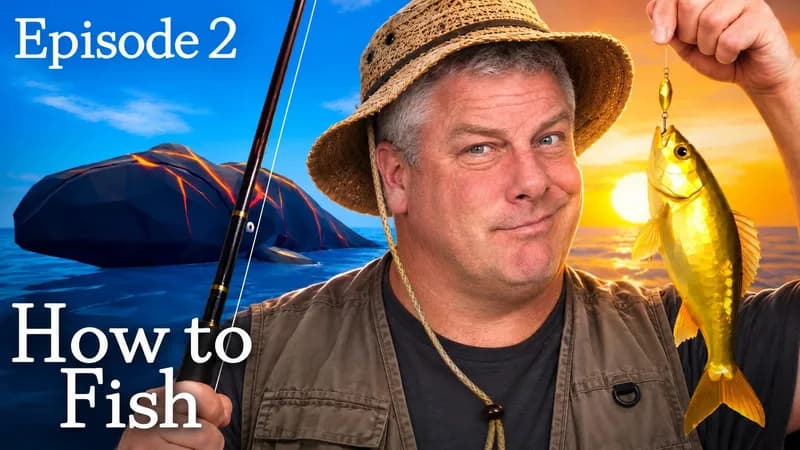
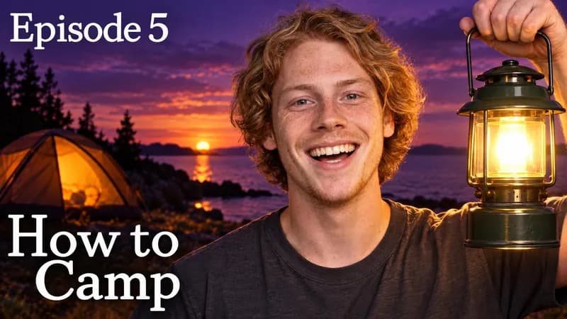
Pasting the whole title. The words box in WThumb takes up to three lines, and spreading a twelve-word title across them is the easiest mistake to make. Twelve words on a 16:9 image become a paragraph in a small typeface, and in a phone feed a paragraph is a texture, not a message. Do the cut first, then type.
Should thumbnail text be in all caps?
For short words, usually yes, but it is a habit rather than a law. Capitals turn a short word into a block with a flat top and bottom, and a block survives shrinking better than a word with letters poking above and below the line. It is also the default, which is the argument against: capitals no longer stand out on their own.
Where capitals hurt is length. Readers recognize lowercase words partly by their outline, and a capitalised MISUNDERSTOOD is a row of same-height rectangles. If your hook is a long word or a four-word phrase, mixed case in a heavy weight can be read faster. Try both, and judge which is read first at feed size, not which looks better at full size.
YouTube's tips page asks you to limit capitals and emoji, but that advice is about titles, where a whole sentence in capitals looks like shouting. On the image, a shouted word is just a legible one.
A word on color and type, because this is not a font post. Use a heavy weight. Put the words on a plain area or a solid block rather than over detail. Keep hard contrast between the letters and whatever is behind them. Let one word be bigger than the rest if one word matters more. The rest is taste, and taste is what the reference is for.
How do I know if my thumbnail text is too small?
Look at it at the size it will be shown, not the size you made it. The file you upload is 3840 by 2160 if you follow the recommendation on YouTube's Add custom thumbnails page as of September 2026, and never smaller than 640 pixels wide; the thumbnail your viewer sees is a small tile on a phone, next to a title, in a column of others. Everything you judged at full size is a guess until you have seen it small.
- Shrink it on your desk. Zoom out until the image is about the size of your thumb, or look at your monitor from across the room. If a word disappears before the face does, it is too small.
- Put it on your phone next to real thumbnails. Send the image to your phone, open the YouTube home feed and hold the two side by side. It is the only test with the real size and the real neighbors. The phone, desktop and TV checks take it from the couch as well.
- Cover the title and read the words cold. With the title hidden, can you read every word without leaning in? The words you cannot read are taking space from the ones you can.
- Check the corners. YouTube lays a duration badge over the bottom right corner of a 16:9 thumbnail, and on Shorts the title and other overlays cover the lower part of the frame. A word there is small and half hidden.
WThumb can produce one or two designs from the same brief, so ask for two, shrink both to feed width and compare them. The one you preferred at full size is often not the one that reads small. Use the title and thumbnail preview to check the image beside the actual title instead of judging either one alone.
YouTube thumbnail text in WThumb: what to type and what to leave in the title
In WThumb the words are part of the brief, not something placed afterwards. You paste a YouTube link (we fetch only that video's public thumbnail) or upload a reference image (PNG, JPEG or WebP, up to 12 MiB). You type the words you want on the thumbnail, up to three lines, and optionally some instructions in plain words, with up to four extra images you can point at as @1 to @4.
The three lines are the cut from the section above, already done. Line one is the biggest idea. Line two finishes it. Line three is often empty, and should be more often than it is. Everything else stays in the title, which is not part of the brief. A personal photo, if you add one (up to 8 MiB), supplies identity input. Skip it to request a faceless composition: WThumb supplies no replacement photo and instructs the model to remove people. Review the finished image before publishing.
The reference is a brief, not a template. WThumb uses the subject, visual idea, energy and role of each element as direction for a fresh layout, framing, typography, color treatment and graphic structure. If the reference has one giant word and a face, describe the idea you want the new design to communicate. Your optional photo provides identity input, not a promise about the finished image. Review both the subject and the words before publishing.
There is no font menu and no size slider, because there is no editor: no canvas, no layers, nothing to nudge by hand. The type treatment comes out of the design, generated by an OpenAI image model from our instructions and your brief, and spelling and size can come out wrong, so check every letter when it finishes. If a word is wrong or too small, press the pencil on the thumbnail and describe one change in plain words (make WITHOUT bigger), and WThumb makes a new version. Each revision costs one credit (1 credit = 1 thumbnail). Run the feed-size test first, then spend it on the change that matters.
Your words pass a moderation check before anything is generated; a refused request is never generated and costs nothing. A run takes about thirty seconds, and the result is a Full HD+ JPEG at 2048 by 1152 for 16:9 or 1152 by 2048 for 9:16; you can tick both in one submission. Paid plans are there when you need more, and new accounts get two free credits with no card needed. Spend the first on this post's test: type three words, shrink the result, and see if it still reads.