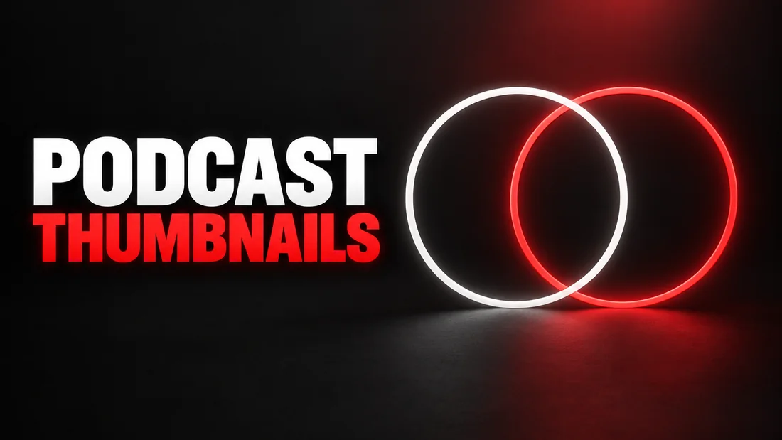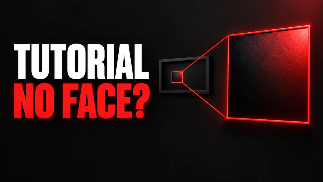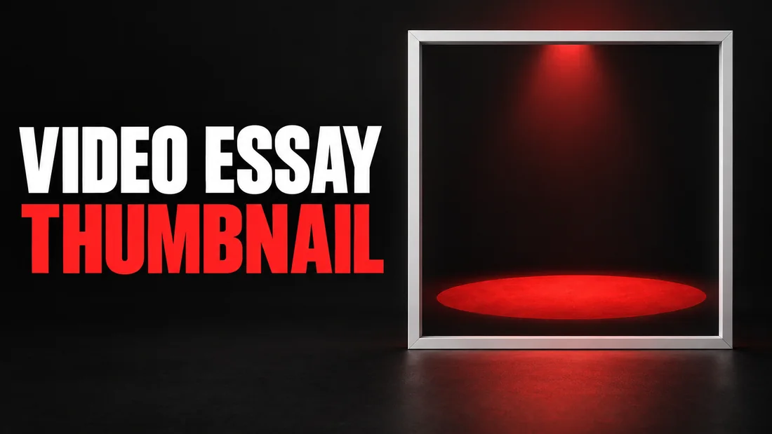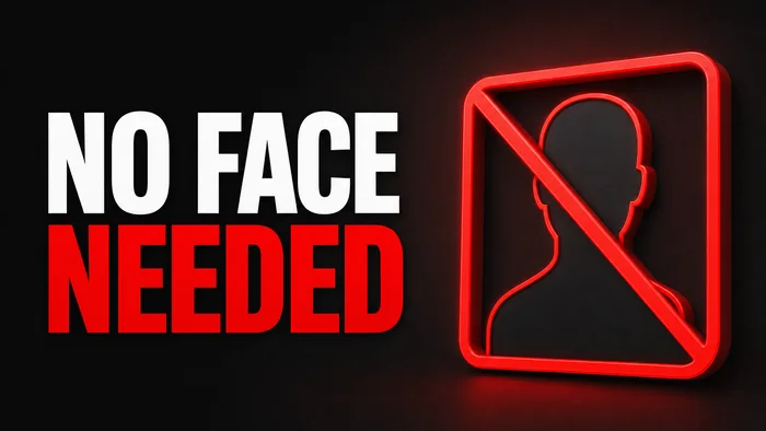
Faceless YouTube thumbnails start from a problem you can check in about a minute. Open the videos you would most like to imitate and count how many of those thumbnails have a person in the frame, usually with a large expression pointed at the camera. If you never appear on camera, the layouts you most want to borrow from are built around someone you do not have.
WThumb makes a new thumbnail from a visual reference, either a YouTube link or an uploaded image, plus your words and instructions. It designs a fresh composition rather than preserving the reference layout. For a faceless channel, the key choice is how the scene will communicate your subject without relying on a personal photo.
The photo step is optional. When you skip it, WThumb supplies no personal or replacement photo and instructs the image model to remove people. The model creates a new scene around your brief. Review the finished image before publishing; the examples below show possible results, not guaranteed outcomes.
What the faceless path does in a run
To make the faceless version, leave the optional personal-photo field empty and explain which object or scene should carry the idea. The rest of the workflow uses the same reference, words, and instructions.
- Pick the frame early. YouTube 16:9 or Shorts 9:16, chosen before the reference. A horizontal reference can be rebuilt into a vertical frame and a vertical one into a horizontal frame; the layout is re-staged for the new shape rather than cropped down to fit.
- Give it a reference. Paste a YouTube link and the thumbnail from that video is pulled in, or upload your own image. PNG, JPEG or WebP, up to 12 MiB.
- Skip the photo. This is the entire faceless decision: one optional field, left alone. Nothing else about the form changes, and there is nothing else to set.
- Write the words and the direction. Two separate fields. One holds the literal text for the thumbnail, up to three lines. The other is where you describe changes in plain words: colors, backgrounds, objects, logos, what should sit where the person used to be.
Then you confirm and it runs. A run takes about thirty seconds and produces exactly one image. There is no editor afterwards, no layers and no canvas to nudge things around on. If it comes back wrong you can revise it by describing a change, one credit per revision (1 credit = 1 thumbnail), or describe it again and run it again.


What faceless thumbnails keep, and what you have to ask for
Leave the photo step empty to request a scene without people. WThumb tells the image model to rebuild the scene around the subject instead of supplying a replacement face. The reference can guide the mood and the role of graphics, but the exact arrows, icons, spacing, and colors are not locked. Name the object that should carry the idea and review the finished image for unwanted people or details. The faceless rows in the Thumbnail.ai alternative and the VisualKit comparison compare this route with two other makers'.
There is no faceless mode. There is a photo step you can leave empty.
What the reference cannot tell the tool is which parts of it you care about. That matters most when the person was holding or presenting something. In a review thumbnail, the phone held up at chest height is not decoration, it is the subject, and the hand around it was only ever there to put it at the right height and the right angle. The person is what you are removing. The phone is not.
So name it. Say what the object is and where it should stay, in the description field: keep the phone in the right half at the same angle and size as the reference. The same goes for a laptop turned toward the camera, a game controller, a book cover, a tool held up next to the head. These objects carry the eye path of the whole composition, and a run that comes back without one leaves you with a background and some text, which is a different thumbnail entirely.
One sentence naming the object and its position is the most useful thing you can put in the description field on a faceless run. Leaving it out is a common reason a run comes back missing the thing the thumbnail was supposed to be about.
References that adapt well to faceless thumbnails
None of what follows is a rule the tool enforces. It is a judgment about composition, and it is worth making before you spend a run. Put your thumb over the person in the reference. If what is left still tells you what the video is about, the rebuild has something to work from. If what is left is a background, it does not.
- Product-led. The object dominates and the person is a frame around it. Unboxings, reviews, comparisons, tool demos. These tend to be the strongest faceless references, because the thing the thumbnail is about is an object you can name in one line of the description field.
- Chart-led. A rising line, a bar chart, a screenshot of a dashboard, a scoreboard. The graphic carries the claim, so the person is already doing the least work in the frame. Finance, stats, sports and analysis channels are full of these. Name the chart and where it should sit, the same way you would name a product.
- Text-led. Huge type across most of the frame with a person occupying maybe a quarter of it. The words themselves come from your own text field, not from the reference, so you are not inheriting the wording; what carries over is the type treatment, the weight and the color. The quarter the person had can be refilled with badges, arrows or an icon in the same style.
- Split-frame. Before and after, this versus that, two halves divided down the middle. The structure here is the grid, not the person, and a person on one side can be replaced by the object or logo that side stands for, if you say which.
Location and b-roll style references tend to work for the same reason: a wide shot of a workshop, a car, a map with a route on it, a close crop of a keyboard. The subject is already an object or a place, and travel guide thumbnails lead with the place for that reason.
References that fight the faceless path
Two kinds of reference tend not to adapt, and it is worth recognizing them before you spend a run.
- Reaction faces. Shock, disgust, wide eyes, mouth open, hands on the head. The face is not part of the composition so much as the whole of it. Take it out and there is not much underneath except background and a couple of words.
- Pure expression thumbnails. A head and shoulders filling most of the frame with two or three words next to it. Take the head out and you are left with a very large area to fill. Graphics can fill it, but at that size they stop working as accents and become the design.
You can still use these references, but explain which object or scene should carry the idea. The result is always a fresh design, so the practical question is whether the brief gives the model a clear subject without the face. A reference built around an object usually makes that easier.
The better move is usually to change the reference rather than the request. Channels in your niche that already work without a face have solved the same layout problem, and their thumbnails make useful layout references: mostly object and type, with nothing that needs removing. A faceless-native reference gets you closer to what you pictured than a face-led one you have argued the person out of.
Three worked faceless thumbnail requests
Here are three complete runs, written the way you would actually type them. In each one the photo step is skipped, which is what makes them faceless.
1. Phone review, 16:9, with the object named
Format: YouTube 16:9. Reference: a review thumbnail from a phone channel, presenter on the left, the phone held up on the right, dark blue gradient background, one yellow arrow. Photo: skipped.
The words on it: DON'T BUY THIS
Anything else: Keep the phone in the right half at the same angle and size as the reference. Fill the left half where the person was with a large red cross badge and a downward arrow in the same flat outlined style as the existing arrow. Keep the dark blue gradient background.
The first sentence is doing the real work. The person is going and the phone is staying, and the description field is the only place that distinction gets made.
2. Finance explainer, horizontal reference into a Shorts frame
Format: Shorts 9:16. Reference: a horizontal thumbnail with a rising green line chart on the right and a presenter on the left. Photo: skipped.
The words on it: two lines, with INDEX FUNDS on the first line and EXPLAINED on the second. The field holds up to three lines, and each line is typed on its own line rather than run together with a slash or a comma. Capitals are rendered as typed.
Anything else: Rebuild this for the vertical frame. Keep the green rising chart and put it across the middle at the same weight and color, with the text stacked above it. Fill the lower third where the person was with three coin icons and a small upward arrow in the same style. Keep the black background.
The frame was chosen before the reference went in, so the horizontal layout is re-staged into the tall frame rather than cropped. Saying where you want the chart to sit is what stops it landing somewhere you did not expect, and saying to keep it at all is what stops it leaving with the presenter.
3. Software tutorial, faceless with an attached logo
Format: YouTube 16:9. Reference: a tutorial thumbnail with the presenter on the right, big white text on the left, purple background. Photo: skipped. One extra image attached: the logo of the software, referred to as @1.
The words on it: STOP USING THIS
Anything else: Put @1 in the space on the right where the person was, at roughly the size their head and shoulders took up, with a red circle-and-slash over it. Keep the white text on the left and the purple background.
Up to four extra images can be attached to a run and pointed at with @1, @2 and so on. For a faceless channel these are usually the things that stand in for a person anyway: a logo, a product shot, a screenshot, an icon you already own.
Making a faceless look you can repeat
A channel with a face in every thumbnail has one element that stays the same from video to video without anyone having to plan it. Without a face, whatever consistency you want has to come from the other parts: one background color, one text treatment, one badge shape, the object in the same corner every time.
With a reference-based tool the practical way to work toward that is to stop hunting for new references. Pick one that adapts well, then reuse it. Be honest about the limit, though: there is no seed, no style lock and no brand kit, one run gives one image, and the same reference with the same notes will not hand you the same picture twice. Reusing a reference is the closest thing available to a repeatable layout, and it narrows the spread more than starting somewhere new each time.
It also helps to write your constants down once, somewhere of your own, and paste the same paragraph into the description field on every run. Something like: black background, yellow text, thin white outline around the object, badge in the top-right corner. There is no brand kit to store that in, so a saved note is the closest thing to a house style, and it costs nothing to keep.
When a faceless run comes back wrong
One run gives you one image and no editor. Fixing means describing a change or describing it all again, so the value is entirely in how precisely you describe it. These are the common faceless failures and what to write.
- A person-shaped shape is still there. Name it and say what should be there instead: there is still a person-shaped shadow on the left, remove it completely and extend the background across that area.
- The space looks empty. Do not ask for something in the gap. Say what goes in it: put a large outlined price badge in the empty left half, same yellow as the arrow.
- The object went with the person. Put it back by name and by position: keep the phone in the right half at the same angle and size as the reference. If you did not name the object on the first run, this is usually why it is missing.
- The graphics do not match. Point at the reference rather than describing taste: use the same flat outlined arrows as the reference, not glossy three-dimensional ones.
- The words came out wrong. The words field is literal, up to three lines. A line typed in capitals is rendered as typed, and a single word on its own is always treated as literal text rather than as an instruction, so keep genuine instructions in the description field and write them as full sentences.
New accounts get two free credits and no card is required. That is enough to find out whether a reference holds up with its person taken out, which is the part hardest to predict by looking at it. They do not renew, so spend them on your two most likely references rather than twice on the same one.