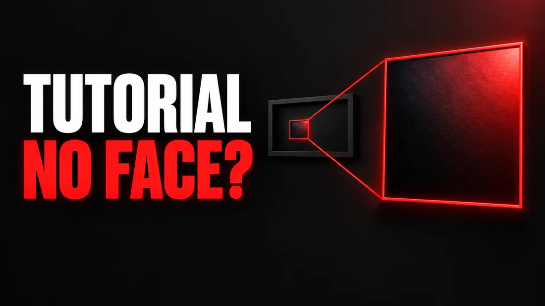
The best tutorial thumbnail from a screen recording shows one thing from the screen, enlarged, with two or three plain words on it, and no person at all. A screenshot of the whole window is the worst choice, because every menu, panel and line of small text collapses into gray noise at the size YouTube shows it in the feed. Pick the button, the menu item, the error message or the finished result, and make that the subject.
Screen-recording tutorials are a rare kind of video where the honest picture of the content is unusable as a thumbnail, so most creators drop a screenshot behind the title and hope. The fix is a choice, not a design skill: decide which single element the video is really about before you open any tool.
In WThumb that choice becomes the brief. You paste a reference link or upload an image, type the words, attach your own screenshot as @1 if the real interface has to appear, and leave the photo out. About thirty seconds later you have a faceless 16:9 thumbnail, and a 9:16 one for Shorts if you ticked both.
The tutorial thumbnail maker puts that workflow on one focused page, with presenter-led and faceless WThumb examples for lessons, explainers, and step-by-step videos.
Why a screenshot makes a weak tutorial thumbnail
A screen recording is filmed at the size of a monitor, and a thumbnail is seen at the size of a stamp. Everything on a full-screen capture was drawn for someone an arm's length from a large display: a thin menu bar, a ribbon of icons, a code editor with a terminal underneath. Shrink that to the width of a phone thumbnail and the detail does not become small; it becomes texture. The viewer sees a light gray rectangle with darker gray stripes.
The second problem is that every tutorial in the same app produces the same rectangle. An Excel tutorial about pivot tables and one about conditional formatting look identical when the whole ribbon is the picture. The screenshot says which app you used and nothing about what you did in it, and the app is usually already in the title.
As of September 2026, YouTube's own Thumbnail & title tips say to try not to make the design too complex. A full window of interface is the most complex design there is, and nobody chose it; it is just what the screen looked like when the recording stopped.
A screenshot tells the viewer which app you opened. A thumbnail should tell them what you did in it.
What to show instead of the whole screen
Choose one thing from the screen and make it the subject. Five kinds cover almost every tutorial we have seen.
- The one control. The button, the menu item, the checkbox, the setting. If the video is how to turn on dark mode in Notion, the thumbnail is the toggle, enormous, and the word ON.
- The result. What the screen looks like when the tutorial has worked: the finished chart, the deployed page, the tidy spreadsheet. Show the thing made, not the making.
- The error. For fix-it videos the error message is the hook, because the viewer arrived by pasting that exact text into search. A red banner, the first line of the message in large type, nothing else.
- The before and after. Two states of the same thing, side by side: the messy sheet and the clean one. This is the honest version of a promise, because both halves are in the video.
- The app icon, used as an object. When the tutorial is about the app itself, the icon can be the subject, treated as a solid thing with light and shadow. It is the weakest of the five, because it still says which app and not what you did.
In every case the element is enlarged far past its real size, the interface around it is gone or reduced to a hint, and the words say the outcome. If you cannot name the one element, the video may be about two things, and the thumbnail will be about neither.
Two worked briefs
Excel, remove duplicates. Reference: a spreadsheet tutorial thumbnail whose idea is one big button on a soft green field. Words: DUPLICATES, GONE, ONE CLICK. Instructions: the Remove Duplicates button is the subject, enlarged, faint grid behind it, no person. Attach your own screenshot of the button as @1 and add: match the button in @1.
Coding, fix an error. Reference: a coding tutorial thumbnail whose idea is one line of red text on a dark editor. Words: CORS ERROR, FIXED. Instructions: one red error banner as the subject with a green tick over it, dark editor tones, no face. If the exact wording matters, attach it as @1 and say: use the error text from @1.
Tutorial thumbnail for a screen recording with no face
A screen recording has no face in it, and the thumbnail does not need one either. In WThumb the faceless path is simply leaving the personal photo out. If the reference you chose has a person in it, that person is removed and the space is filled in the same style, and nobody else's face is ever added. If you add your own photo, you are placed in the design.
Many good references come from channels that show a presenter pointing at a dialog box. You can still use them: the idea carries over, the dialog box as the subject and the pointing energy, and the design is new, without the presenter.
The reference is a brief, not a template. WThumb keeps the subject, the visual idea, the energy and what each element is for, then designs its own layout, framing, typography, color treatment and graphic structure. Do not expect the reference with the person cut out; expect a new design built on the same idea.
One caution that is specific to tutorials. The generator is an OpenAI image model working from your words and images. It will produce a convincing dialog box or error banner, but it does not promise to reproduce your app's interface pixel for pixel, and small interface text can come out plausible rather than exact. If the real interface must appear, attach the real screenshot as @1, name the element to enlarge, and check the finished image at small size before you upload it. If it must be pixel-exact, an editor is the honest tool, and we name them in the last section.
How to brief WThumb for a tutorial thumbnail
One form, about thirty seconds from link to finished image. Here it is in order.
- Pick a reference for its idea, not its app. Paste the link of a tutorial thumbnail that already does the one-element trick; WThumb fetches only that video's public thumbnail image. Or upload your own PNG, JPEG or WebP up to 12 MiB. A Photoshop tutorial with one giant slider is a fine reference for an Excel video.
- Attach your screenshot as @1 if the interface must appear. Crop it to the element first, so the model sees the button and not the whole window. Up to four extra images can be attached and named @1 to @4, so a before and after can be @1 and @2.
- Type up to three lines of words. The outcome, not the title. DUPLICATES and GONE. ERROR and FIXED. Short words survive feed size; long ones do not.
- Write the instructions in plain words. Name the subject and its size, name the absence (no person), point at your images (match the button in @1), and name the mood if it matters.
- Leave the photo out. That is the faceless path: any person in the reference is removed and the space is filled in the same style.
- Tick 16:9, and 9:16 too if the tutorial is also going out as a Short. Both can be ticked in one submission, so one brief produces both. The output is a high-quality Full HD+ JPEG at 2048 by 1152 or 1152 by 2048, well above the 640-pixel minimum width YouTube sets as of September 2026. You can ask for one or two designs from the same brief.
- Check it small, then revise if needed. Check it at phone width. If one thing is wrong, press the pencil on it and describe one change in plain words, and WThumb makes a new version. Each revision costs one credit (1 credit = 1 thumbnail), and the new version can be revised again. There is no editor: no canvas, no layers, nothing to nudge by hand.
Your words are checked by a moderation service before anything is generated; a refused request is never generated and costs nothing. No card is needed to start, and new accounts get two free credits. Paid plans are there when you need more.
Which words go on a tutorial thumbnail?
The outcome, in two or three words, and never the title. The title next to the thumbnail already says how to remove duplicates in Excel, so the words on the image should say what the title cannot.
- The state at the end. GONE, FIXED, DONE, WORKING, CLEAN. One word, and the element in the picture is what it applies to.
- The count or the time. ONE CLICK, 2 MINUTES, NO CODE, and only when they are true in the video. A thumbnail that promises a result the video never reaches is the tutorial-shaped version of a misleading thumbnail, and as of September 2026 YouTube's thumbnails policy lists misleading viewers about what is in the video among the things that can get a thumbnail removed.
- The app name, only when the title omits it. Usually the title has it. If the video covers several tools, the one the thumbnail shows can carry its name.
- The version, honestly. If your Excel, Premiere or Node version decides whether the steps work, put the year or the number on the image and in the title.
On the typeface, YouTube's tips page, as of September 2026, has one line: if you add text, use a font that is easy to read. In WThumb you do not pick a typeface; you type the words and the model sets them. Make the words short enough that any heavy typeface will carry them, and judge the result at feed size.
Two habits sink tutorial thumbnails: a sentence on the image, when the title is where the sentence lives, and words on top of a busy interface. If the words have no room, that is one honest use of a revision. Language lessons add a second question, which language the words go in; the language learning thumbnail ideas answer it.
Do you need a face on a tutorial thumbnail?
No. YouTube's thumbnail and title tips, as of September 2026, do not require a face. They ask you not to make the design too complex and to use a font that is easy to read; a shocked face is mentioned there as one example, not a rule. We do not measure clicks and will not tell you a face beats a button; for a screen recording, the screen element is the subject.
A photo helps in two cases. If your channel is built on you, a viewer who knows your face uses it to find your video in a list, and then the face is a label rather than a subject: small, with the element still the biggest thing. And if the tutorial is really an opinion, why I stopped using this app, the reaction is the content. In WThumb you add the photo, up to 8 MiB, and you are placed in the design; the same brief without it gives the faceless version, so you can run both and decide.
When to use an editor instead. If the thumbnail has to show the real interface exactly, for a client or a brand guide, take your own screenshot, crop it to the element, and set it with words in Canva, Adobe Express, Figma or Photoshop. Those tools give you control over pixels that a generator does not; check whether the one you use handles the 3840 by 2160 size YouTube suggests as of September 2026 and the 9:16 crop for Shorts. WThumb is the right tool when you want a designed thumbnail from an idea and the interface can be a likeness rather than a copy.