The finance YouTube thumbnail ideas that hold up are quiet ones: one specific number, one chart direction, one object (a cut-up card, a statement line), a calm or sceptical face, and one accent color on a neutral frame. A finance viewer's first question is not "is this exciting?" but "is this real?", so the loud tricks from other niches (the shocked face, the rainbow palette, the fake app badge) look like a scam to this audience.
There is also a rule that most lists of ideas skip. As of September 2026 YouTube's thumbnails policy does not allow a thumbnail that misleads viewers into thinking they are about to see something that is not in the video, and its spam policy names malicious clickbait and get rich quick investment schemes. Bold is fine. A promise the video does not keep is not. This post draws that line first, then gives finance briefs for WThumb on the right side of it.
One limit up front. WThumb draws from your brief (a reference link or image, up to three lines of words, instructions in plain words) and never sees your video. The words you type pass a moderation check before anything is generated, but that is not a fact check. Whether the thumbnail is honest is on the creator.
When the brief is ready, the finance thumbnail maker gives it a focused starting point with real WThumb savings and bills examples, plus reminders to verify every figure.
Finance YouTube thumbnail ideas
Most lists say add dollar signs and a red splash. The thumbnails of finance channels people trust are calmer, and they use two or three of five elements. The list holds for stock market, trading, crypto and personal finance channels; only the object changes.
- One specific number. $40,000, 7.2%, 18 months. One figure, large, and the figure the video is about. A size word (BIG, HUGE, INSANE) is a shout; a specific figure is a claim the viewer can check by watching.
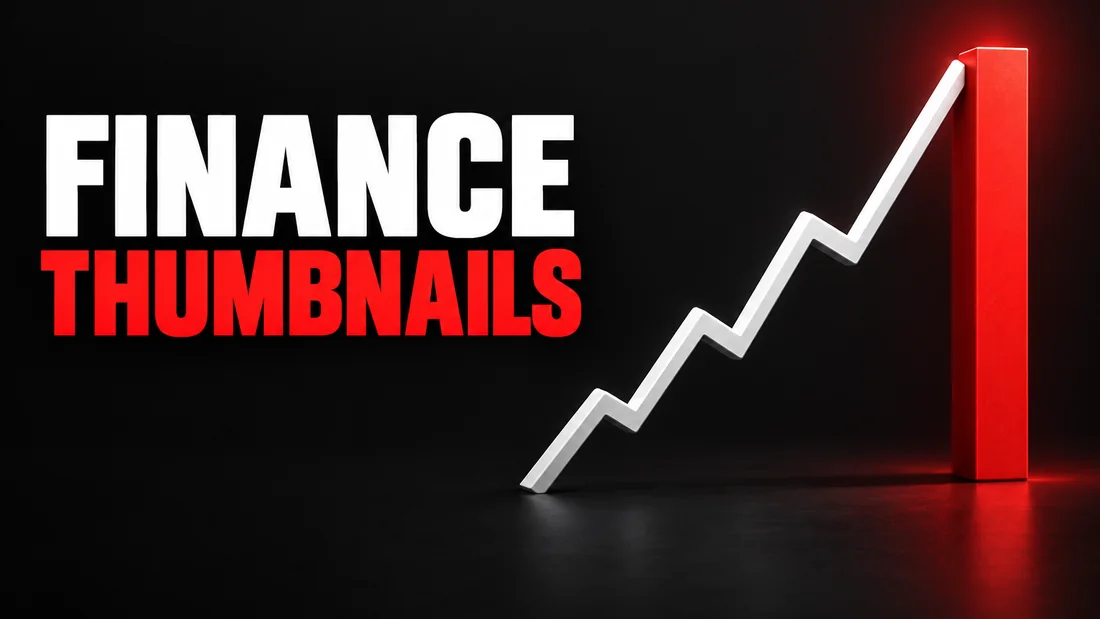
- One chart direction. Up, down, or up and then down. Not a screenshot of a chart but the shape of one, thick enough to read at feed size, in the color the direction implies.
- One object that stands for the subject. A cut-up credit card for debt, a statement line for income, a coin for crypto, a house key for property, a red stamp for a warning. It makes the topic obvious before the words are read.
- A calm or sceptical face. A raised eyebrow, a level look, a hand on the chin. In finance the face is the viewer's proxy: someone about to check the claim, not someone just surprised by it.
- One accent color on a neutral frame. Mostly gray, white, navy or black, with green or red used once, where it means something. In our view a rainbow-bright thumbnail looks like the ads this audience scrolls past.
What does YouTube's misleading thumbnail rule actually say?
Two policy pages matter, both quoted here as of September 2026. They could change, so read them before relying on a detail.
The thumbnails policy lists what is not allowed on a custom thumbnail. Alongside sexual and violent content, it names "a thumbnail that misleads viewers to think they're about to view something that's not in the video". The same page opens by ruling out impersonation, including "deceptively copying the branding, content, or usernames" of other people and channels. The consequence is plain: "we remove the thumbnail and may issue a strike against your account". A first violation is typically a warning, and three strikes within 90 days can lead to channel termination.
The spam, deceptive practices and scams policy is the page finance creators should read twice. It defines malicious clickbait as using maliciously misleading titles, thumbnails, descriptions or imagery to trick users into clicking on a video that does not deliver what was promised. Under scams it lists promoting get rich quick investment schemes, next to fake job offers. The same three strikes line applies, and the page says violations can also lead to suspended monetisation.
One more signal, not a rule. In December 2024 Google's India blog said YouTube was strengthening enforcement against what it called egregious clickbait: a title or thumbnail with promises the video does not deliver, especially around breaking news. It began in India, with the first removals made without a strike. Not a global policy page, but it shows which way enforcement is moving.
YouTube does not forbid bold. It forbids a promise the video does not keep, and it names investment schemes specifically. That is the line. Health channels meet it with a different word, CURED, as the post on medical YouTube thumbnails explains, and the formats every niche shares are sorted by promise in the general YouTube thumbnail ideas.
Where is the line between bold and misleading?
Three pairs make the policy concrete. In each, the picture can be identical; what changes is whether the video delivers it.
The dollar figure
I LOST $40,000 is bold, and fine, if the video is about losing $40,000 and shows it: the position, the statement, the date. The same words on a video that never discusses the figure is what the thumbnails policy describes. The test is not whether the number is dramatic but whether it is in the video.
The crash claim
CRASH? over a sceptical face, on a video that weighs crash risk and lands on probably not, is honest, because the video is about the question. CRASH in capitals, over fire, on the same video, promises an event the video says is unlikely. Value Stock Geek's Clickbait vs. Reality piece describes that exact picture, a concerned face against fire with a crash or collapse claim, and notes that a prediction with no date can never be wrong: "A forecast without timing is useless". A question mark is honest only when the video actually asks the question.
The arrow
A red arrow pointing down on a video about a stock that fell is a summary. The same arrow on a video about a stock that rose, chosen for attention, contradicts the content.
A working rule for all three: every number, chart, arrow and warning on the thumbnail must appear in the video, with the same direction and the same meaning. If defending it starts with "well, technically", it is on the wrong side.
Numbers, charts and arrows: use the direction, not the screenshot
The most common finance thumbnail mistake is not dishonesty. It is a chart screenshot pasted at full size with a face beside it. At phone size the gridlines vanish, the labels become gray noise, the candlesticks become a texture, and what is left is a rectangle that says chart.
Keep the shape and lose the detail. A chart on a thumbnail should be one line, thick enough to read at stamp size, going in one direction, in the one color that direction implies. One direction per thumbnail: a line that goes up, then down, then up again is a story, and a thumbnail can only make one claim. Draw the part the video is about; the full chart belongs in the video.
Numbers follow the same logic. Plain white digits at the same size as the other words leave face, number and logo competing, none winning. Let the number be the largest thing on the image and the other words its caption.
In WThumb, give the number its own line in the words box and ask for it as the largest element. If you have the real chart, attach it as @1 and write: one thick line following the direction in @1, no gridlines or labels. The attachment is part of the brief, not an image to paste in, and WThumb makes no promise that the digits come out right every time, so check them before you upload.
Warnings and crash thumbnails without a promise
Warning videos are where the policy bites hardest, because the temptation is to promise the disaster. Four swaps keep a warning thumbnail bold and honest.
A sceptical expression instead of a shocked one. Shock says the event has happened. Scepticism says the creator is weighing a claim, which is what a warning video usually is.
A warning sign instead of a fire. A warning triangle, a single red line across a chart, a red stamp reading RISK: these say danger is possible. Fire says the danger has arrived, and if the video does not deliver it, the viewer was misled.
A question where the video asks one. CRASH? BUBBLE? TOO LATE? are honest when the video weighs the question, even when it answers no. They are not honest as decoration on a video that never asks.
The video's own conclusion, not a louder one. If the video ends on probably not, but here is what to watch, the thumbnail can carry the watching: a calm face, one line on a chart, a phrase like WATCH THIS LEVEL. Picture and video agree, and that agreement is what the rule protects.
A crash thumbnail is fine on a video about crash risk. A crash thumbnail on a video that says probably not is what the policy describes.
Stock market thumbnail ideas: seven briefs for WThumb
Each brief names a reference to look for, up to three lines for the words box and plain-word instructions. Paste a link to a finance video with the idea you want (WThumb fetches only that video's public thumbnail), or upload a reference image, then tick 16:9, 9:16 or both. The reference is a brief, not a template: WThumb keeps the subject, the visual idea, the energy and the role each element plays, and designs its own layout, typography and color treatment. The idea carries over; the design is new. A run takes about thirty seconds.
- The loss, told straight. Reference: one big figure and a level face. Words: I LOST, $40,000, IN 3 MONTHS. Instructions: the figure is the largest element, red on neutral gray; my expression calm, not shocked. Only run it if the figure and the three months are in the video.
- Crash risk as a question, faceless. Reference: a warning sign and a chart line. Skip the photo, and the person in the reference is removed and the space filled in the same style. Words: CRASH?, OR NOT. Instructions: one thick line rising then dipping, a small warning triangle, one red accent, no fire.
- The dividend statement. Reference: a single statement line or a receipt. Words: $612, A MONTH, IN DIVIDENDS. Instructions: the monthly figure in green as the focal point, everything else quiet. Type the real figure, not a rounded-up one.
- Direction from your own chart, using @1. Attach the chart from the video, coin or stock, as @1. Words: DOWN 40%, NOW WHAT. Instructions: one thick red line following the direction of @1, no gridlines or labels, my face to one side, sceptical. @1 is part of the brief, not an image to paste in.
- The card cut in half, in 9:16 for Shorts. Tick 9:16 only. Reference: a single cut-up card. Words: DEBT FREE, AT 31. Instructions: the card halves fill the lower part, the number at the top, high contrast so it reads at Shorts size, no small text.
- The two-choice comparison. Reference: a thumbnail split into two halves. Words: RENT, OR BUY, 2026. Instructions: a house key on one side, a rent receipt on the other, one green tick on the side the video actually favours. If the video says it depends, no tick on either.
- The scam warning, done honestly. Reference: a red stamp or a struck-through object. Words: THIS IS, A SCAM. Instructions: a red stamp over a generic phone screen, no real app name or logo, my face sceptical. The thumbnails policy also rules out deceptively copying another channel's branding, so keep real logos off it.
After a thumbnail finishes, press the pencil on it and describe one change in plain words, and WThumb makes a new version. Each revision costs one credit (1 credit = 1 thumbnail), and the new version can be revised again; there is no editor behind it. And new accounts get two free credits, no card needed, with paid plans there when you need more.
WThumb asks an OpenAI image model for a design from your words and your reference. It does not know what your video says, so each brief is only as honest as the video behind it. Type the real number, the real direction and the real verdict, and the thumbnail stays on the right side of the line.