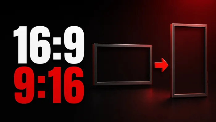
You have a thumbnail that works at 16:9. The face sits right of center, three words stack on the left, a hard rim light separates the shoulder from a dark background. Now the same video is going out as a Short, so you need a YouTube Shorts thumbnail: the same idea in a 9:16 frame. The obvious move is to crop it, and cropping is what breaks it.
Here is the geometry. Taking a 9:16 slice out of a 16:9 image keeps a little under a third of the original width. Everything that lived in the outer thirds is gone, and in most landscape thumbnails that is either the text or the face. Whichever one survives is now sitting off-center against a background that was composed for a shape it is no longer in.
A vertical thumbnail has to be built as a vertical thumbnail. That does not mean starting from nothing. It means taking the landscape composition apart and staging it again for a tall frame: text up top, subject beneath, less background, fewer things sitting next to each other. Here is what moves, and why.
Why cropping a 16:9 thumbnail into a Shorts thumbnail fails
Cropping is tempting because it is fast and because the image already exists. What it actually does is delete two thirds of the composition and then ask the remainder to do the same job.
- The pairing breaks. Most 16:9 thumbnails work by putting two things beside each other and letting the gap between them do the reading. Text left, face right. A crop keeps one of them.
- The subject lands in the wrong place. A face composed to sit off-center in a wide frame ends up shoved against an edge in a narrow one, or dead center with the shoulders cut.
- Nothing fills the height. A 16:9 crop is short. Filling a 9:16 frame with it means scaling up, which enlarges every soft edge and every compression artefact already in the source.
- Bars look like a repost. Padding the top and bottom instead is honest, but a wide image floating in a tall frame reads as recycled, and the bands above and below it are space the subject could have been using.
None of this is a quality problem you can fix with a sharper source image. It is a layout problem. The arrangement was correct for one shape and is not correct for the other.
What a wide frame solved with space, a tall frame has to solve with order.
The format is chosen before the reference is read
In WThumb the output frame is picked right after you choose how to start, before the reference is even read. YouTube 16:9 or Shorts 9:16, or both. Then you supply the reference: paste a YouTube link and the tool pulls that video's thumbnail, or upload your own image.
That order is deliberate. The frame is the constraint every later decision answers to. Where the text sits, how tight the face is cropped, how much background survives, all of it depends on the shape it has to fit. Decide the shape last and you are converting. Decide it first and you are composing. Use that brief to build a vertical Shorts thumbnail as a fresh composition.
You can select both formats in one Studio submission with the same reference, optional photo, and words. Each format is generated as a separate run with its own composition and output. Each completed output uses one credit (1 credit = 1 thumbnail), so a completed 16:9 and 9:16 pair uses two credits.


What changes in a vertical thumbnail: the text moves to the top
In a landscape thumbnail, text usually lives in a side column. Left third or right third, ranged to one edge, with the subject holding the other side. In a vertical frame there is no side column. The width that made the column possible is the width you just lost.
So the text should move to the top and center. It becomes a headline sitting above the subject rather than a block standing beside them, and it centers because there is no longer an asymmetry to balance against.
That is a description of what the vertical version needs, not something that happens by itself. There are no layout controls in WThumb, no grid and no text box to drag. Placement follows the reference you gave it and whatever you write in the second field. So if the words belong at the top of the frame, that is a thing to ask for in plain words.
Shorter lines, and fewer of them
The words themselves have to shrink. A seven-word line that fitted comfortably across a 16:9 frame will wrap into three ragged lines at 9:16, or be set so small that nobody reads it at the size a Short is actually watched. Cut the sentence down to the part carrying the hook. HOW I EDIT TEN VIDEOS EVERY WEEK becomes TEN VIDEOS A WEEK.
The words field takes up to three lines. In vertical, two is usually the right number and three is the ceiling rather than the target. Where the break falls matters more than it did horizontally, because a bad break in a centered stack is very visible.
One thing worth knowing about how that field is read: a line typed in capitals is treated as literal text to render. A sentence like write TEN instead of ten is read as an instruction about the text rather than as the text itself. A single word on its own is always treated as literal.
Leave room at the bottom, too. A Shorts thumbnail is not what anyone sees while the video plays, because the video itself fills that screen. Where it does appear is the Shorts shelf on the home page, in search results and on the Shorts tab of your channel, and in those places the view count is laid over the lower-left corner of the image. Anything that has to be read should stay clear of that corner and the band it sits in.
The subject drops, and the face gets bigger
With the text at the top, the subject drops below it. Not immediately below. The gap between the headline and the top of the head is doing work, and closing it makes both halves harder to read.
Then the face gets bigger. This is arithmetic rather than taste. A head that occupied a quarter of the width in a 16:9 frame occupies a quarter of a much smaller number in 9:16, and shrinks to something you cannot read an expression off. To hold the same presence in a narrower frame, the face has to take up more of it.
In practice that means tighter framing than the landscape version. Head and shoulders, top of the chest at most. Full-body poses and wide two-shots rarely survive the move, because at 9:16 the body goes tall and thin and the face ends up small at the top of it.
You are not doing that cropping yourself. There is no framing control to adjust by hand. The reference and your instructions guide a fresh composition; your photo supplies identity input rather than inheriting the reference person's pose, framing, or lighting. If you want head-and-shoulders framing, ask for it in the instructions. Review the finished image to check that the face is clear and the framing fits your brief.
If you skip the photo
Leave the photo out to request a faceless version. WThumb supplies no replacement photo and instructs the model to remove people, then compose the scene around your subject. A vertical brief can stack an object, headline, and supporting graphics. Review the finished image for unwanted people or details before publishing; the instruction is not a guarantee.
Backgrounds simplify because a vertical thumbnail has less width
A 16:9 background has room for a scene. A desk with three readable objects on it, a street, a set with depth. There is width to spread detail across, and the eye has somewhere to travel.
At 9:16 that width is gone, and the detail does not scale down gracefully. Small objects become texture. Texture behind a face becomes noise. The background stops being a scene and starts being something the subject has to fight.
So it simplifies. What survives the move is broad: one color, one gradient, one large shape, a blur, a single recognizable object placed on purpose. What does not survive is a crowd of props, a row of small logos, text baked into the scenery, and busy patterns.
The second field, the one for anything else, is where you say this in plain words. It is the field for describing changes to colors, clothing, backgrounds, logos and objects. Plain dark blue background, remove the desk clutter is a usable instruction. So is keep the monitor and blur everything behind it. You are not asking for a different picture. You are asking for less of one.
Contrast still does the job it did horizontally. Bright subject on a dark ground, or the reverse. The narrower the frame, the more of the work that separation is carrying.
Side-by-side elements have to stack
Some compositions are built on two things sitting beside each other. Before and after. This versus that. A split down the middle with a divider. At 16:9 they are natural. At 9:16 they collapse into two skinny columns and neither half is legible.
The fix is to stack rather than shrink.
- Split top and bottom. A vertical divider becomes horizontal. Before on top, after underneath, or whichever order reads better.
- Rotate the arrows. An arrow that pointed left to right now points down. Directional graphics carry the comparison, so they have to point the way the layout runs.
- Turn rows into columns. Three logos in a row become a column of three, or two above one, or two if the third was never earning its place.
- Move corner badges inward. A number or badge that sat in an outer corner of a wide frame has no outer corner to sit in. Overlap it against the edge of the subject instead.
All of that is written, not dragged. Each of those is a sentence in the second field rather than a handle you move. The same goes for anything you attach: up to four extra images can be added and pointed at with @1 and @2 in the request. Put @1 above the face and @2 below it is the vertical version of the instruction you would have written as left and right.
Running a landscape reference into a YouTube Shorts thumbnail
Put together, a landscape reference into a vertical output looks like this.
- Pick Shorts 9:16 first. Before the reference. The frame is the decision everything else is made against.
- Give it the horizontal reference anyway. Paste the link to the video whose thumbnail you like, or upload the image. A horizontal reference is a legitimate starting point for a vertical output, because the layout is re-staged for the new frame rather than cropped into it.
- Add your photo, or skip it. One clear portrait supplies identity input. Skip it to request a faceless composition: WThumb supplies no replacement photo and instructs the model to remove people. Review the finished result before publishing. Uploads can be PNG, JPEG or WebP, with photos up to 8 MiB and references up to 12 MiB.
- Write shorter words than the horizontal version. Two lines where the 16:9 had three. The hook, not the sentence.
- Use the second field for the vertical-specific changes. Text at the top. Simplify the background. Stack the comparison. Move the badge inward. Say it the way you would say it to a person.
- Confirm and run. About thirty seconds, and one image at the end of it.
There is no editor afterwards. No layers, no canvas, nothing to nudge by hand. If the text sits too low or the face is too small, you describe that change in a revision, for one credit each time. Which is a real reason to be specific on the first attempt: text at the top, centered, two lines, face below with a gap between them is a better opening request than hoping.
New accounts get two free credits, and no card is needed. They do not renew. Running one 16:9 and one 9:16 from the same reference uses both.