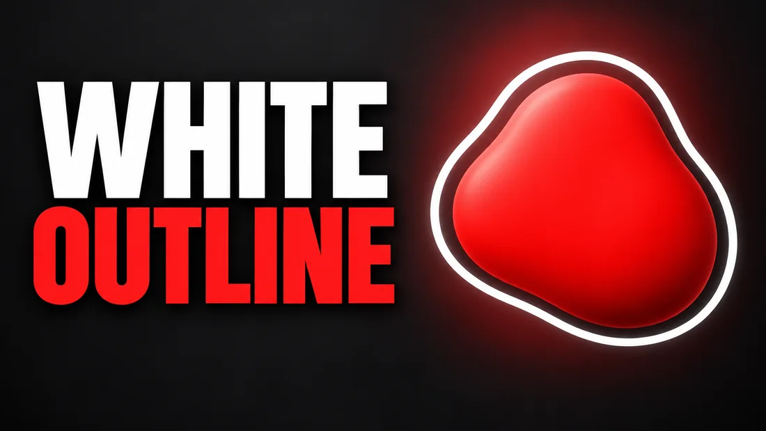
A white outline thumbnail is a cut-out of a person with a thick pale stroke traced around the edge, and its job is separation: it draws the edge between you and the ground when the photo did not give you one. Keep it when the ground is busy (a game frame, a screenshot, a wall in your own tone); skip it when a flat, contrasting ground already separates you. As of September 2026, YouTube's thumbnail impressions page says impressions are counted if the thumbnail is shown for more than 1 second and at least 50% of the thumbnail is visible on the screen. The outline is a tool for that second, not a style.
This post covers what the stroke does, when the ground does the job instead, how thick and what color, which photo outlines well, and how to ask WThumb for it without masking anything. Separation is part of contrast, one check among the best practices for YouTube thumbnails.
What the outline does
This section explains the job the outline is hired for: it draws an edge the photo did not give you. A cut-out on a plain ground has an edge already, because the ground is one tone and the person is another. Put the same person in front of a cluttered shelf, a game frame or a wall close to the tone of their jacket and the edge goes.
As of September 2026, YouTube's Thumbnail & title tips page says thumbnails show up differently across devices, so make sure your thumbnail image is as large as possible. A subject that takes a moment to find on a monitor is never found on a phone: an impression counts from one second on screen, and a thumb scrolling a feed rarely gives you longer. The white outline fixes that: a band of one bright tone between the person and everything behind them, so the silhouette reads before the face does.
The effect is a stroke around the person, not a frame around the picture: a frame separates the thumbnail from the page; a stroke separates you from the ground. The words do not need it. FLAT OUT WRONG in a heavy weight on a dark patch reads already, and the same words with a white stroke around each letter read worse, because the stroke eats the gaps in the letters.
When you do not need it
This section is the case against the outline, the one YouTube thumbnail colors makes at length: the ground can do the separating. A dark jacket on flat pale yellow has an edge already. So does a pale face on deep navy. When the ground is one flat color far from your skin, hair and clothes, a stroke adds a second edge to a subject that had one, and the picture starts to look like a sticker.
Two other things give you the edge. Rim light: a lamp behind you and to one side puts a bright line along the hair and shoulder, an outline made by a lamp instead of a mask. And a darker patch behind the head, so the face is the brightest thing in its neighborhood.
The thick white stroke also reads as loud, because the channels that made it famous are loud. On a sermon, a history documentary, a book review or a sober finance explainer, the sticker look says the wrong thing before the words do. As of September 2026, YouTube's Thumbnail & title tips page says dynamic use of color and composition can help catch the eye, but too much can overwhelm it. A stroke on a subject that already separates is the too much.
A brief to paste
- Words. 5 MISTAKES on one line.
- Instructions. Me in a dark jacket on a flat pale yellow ground, no outline around me, a softly darker area behind my head.
When it earns its place
This section lists the four grounds where the outline is the honest fix, because the ground cannot be changed or made flat.
- A screenshot or a game frame behind you. A reaction or gaming thumbnail puts you in front of someone else's picture, and flattening it loses what it shows. A thick white edge keeps you from dissolving into the map.
- A wall the same tone as you. A beige wall behind a beige coat, a gray hoodie in a gray studio. Reshooting is the better fix; when the frame is what you have, the stroke draws the boundary the tones refused to.
- Two subjects that would merge. A versus thumbnail with two people, or a product held against your chest. Where shapes overlap in similar tones, a stroke around the front one says which is in front. Outline one, not both.
- A Short with a tight crop. As of September 2026, YouTube's Add custom thumbnails page says to try to upload a thumbnail with an aspect ratio of 9:16 for Shorts. The tall frame crops close on a face, and the ground is often a frozen frame of the video.
The test is the same each time: imagine the picture without the stroke. If the subject still reads, the stroke is decoration. If it melts into the ground, keep it.
A brief to paste
- Words. I WAS WRONG on two lines.
- Instructions. Me reacting in front of a busy game map, a thick white cut-out outline around me only, none on the words.
Thick, white, and only one
This section sets the three rules for the stroke: thick enough for a phone, a color the ground does not contain, and one edge.
Thick, because the phone shrinks it
A thin outline is a halo on a monitor and nothing on a phone. As of September 2026, YouTube's 5 tips for YouTube success on TV post, from November 2024, says that on TV screens thumbnails are supersized, front and center, and to keep your designs clean, balanced and easy to read. In a phone feed the same image is tiny, so a stroke that looks right on a TV is too thin there; slightly heavy on a monitor is right. The stroke also scales with the subject: a face filling half the frame carries a heavier stroke than a half-body shot, and face size in a YouTube thumbnail sets out the three sizes.
White, unless white is the ground
White is brighter than almost any ground and any skin tone, so it contrasts on both sides. On a pale ground it vanishes: on a cream wall the fix is black, or the channel's accent color if it is far from the ground.
One edge, not three
The tutorials often stack an outline, an outer glow and a drop shadow on one cut-out. That is three edges, each softening the other two. Keep one hard edge. The corner is the other failure. As of September 2026, YouTube's design language post from November 2022 says YouTube addressed two highly visible elements, buttons and video thumbnails, and confirmed that rounded shapes feel more friendly, inviting and comfortable to tap. Thumbnail corners on the page are curved, so an outline that runs into a corner is clipped; let a shoulder leave through the bottom edge instead.
Getting it without masking
This section is for a creator who has watched the Canva or Photoshop tutorial and does not want to mask hair by hand. Those tutorials work: the outline is a layer, a white shape behind a cut-out of you, and masking the hair is the slow part. In a generator there are no layers, so the outline is a request, and in WThumb the request lives in the instruction line.
The phrasing
Say what the outline is, where it goes, and where it does not go: a thick white cut-out outline around me, none on the words. Cut-out says the edge follows the body; thick, so the request is not read as a hairline; none on the words keeps the stroke off the text. How to describe a thumbnail so you get it right covers the rest.
The reference that has it
The other way in is a reference: paste the link of a thumbnail that already has the stroke. The reference is a brief, not a template: the subject, the idea, the energy and the role of each element carry over; the layout, framing, typography and color are designed fresh. The outline carries over as an idea; the picture is new.
Two mistakes
- Asking for a border. A border is a frame around the whole image, which separates nothing. Write outline around me.
- Letting it land on the words. Without none on the words, the stroke can land around each letter too, and the words go fuzzy.
The photo that outlines well
This section is about the personal photo, because the outline follows your edge, and a bad edge makes a bad outline. Three things decide it; a fourth no generator rescues.
Distance from the wall. Stand a few steps in front of it; against it, your shadow joins your silhouette and the stroke traces it too, so the outline goes lumpy.
Hair against a plain ground. Fine hair on a busy ground is where every mask fails, by hand or by model: the edge eats the hair or keeps a fringe of ground with it. Shoot in front of one plain tone; if your hair is dark, make that tone light.
No fingers over the shoulder line. A hand crossing the body, a phone at the chest, a strap, a mug: each joins the silhouette the stroke has to trace. A hand held out to the side gives one clean shape. The full shot list is in how to take a photo for a YouTube thumbnail.
What no generator rescues is a soft edge. A blurry phone shot or a low-light frame from the video has no crisp boundary, and the stroke inherits the fuzz. As of September 2026, YouTube's Add custom thumbnails page says to use a resolution of 3840 by 2160 pixels for videos, with a minimum width of 640 pixels, in image formats such as JPG or PNG. A soft outline at the minimum width is a gray fringe. Start from a sharp photo at the largest size you have.
How to do this in WThumb
This section is the run itself, and the check that follows it.
- Paste or upload the reference. Paste a YouTube link (WThumb fetches only that video's public thumbnail) or upload a PNG, JPEG or WebP. A reference with the stroke brings the effect into the brief; the idea carries over, the design is new.
- Type the words and one instruction line. Up to three lines, such as I WAS WRONG on two, plus one plain line: a thick white cut-out outline around me, none on the words.
- Add your photo. With a photo you are placed in the design, so the outline has your edge to follow. Skip it and the thumbnail is faceless: the person in the reference is removed and the space filled in the same style.
- Pick the format and the count. 16:9 for the video, 9:16 for a Short, or both from one brief, and one or two designs.
- Wait about thirty seconds. The result is a Full HD+ JPEG. There is no phone preview in WThumb, so open the file on your phone and check the edge at feed size.
- Revise it if the edge is thin. The pencil on the finished thumbnail takes one sentence, make the outline thicker, and makes a new version. Each revision costs one credit (1 credit = 1 thumbnail).
Two lines, two niches
- Loud niche. A thick white cut-out outline around me, none on the words. For reaction, gaming and versus thumbnails, where you sit on someone else's frame.
- Calm niche. A darker ground behind my head, no outline. The ground does the separating, and the sticker look stays off a sermon or a history thumbnail.
On a new account the first two cost nothing, because the account starts with two free credits, no card needed.
An outline is an edge you draw because the photo did not give you one. If the ground already gives you the edge, skip it.